

You finish your first app and it works. Every button clicks, every page loads, and yet the whole thing looks like a school project wearing a suit two sizes too big. The features are fine. The feel is what is missing, and that gap is the difference between something people trust and something they quietly close.
In short, a modern UI (user interface) is the look and feel of your app: the spacing, type, color, and layout choices that make it read as polished instead of homemade. The good news is that almost none of that is talent. It is a small set of repeatable rules, and once you can name them, you can ask for them.
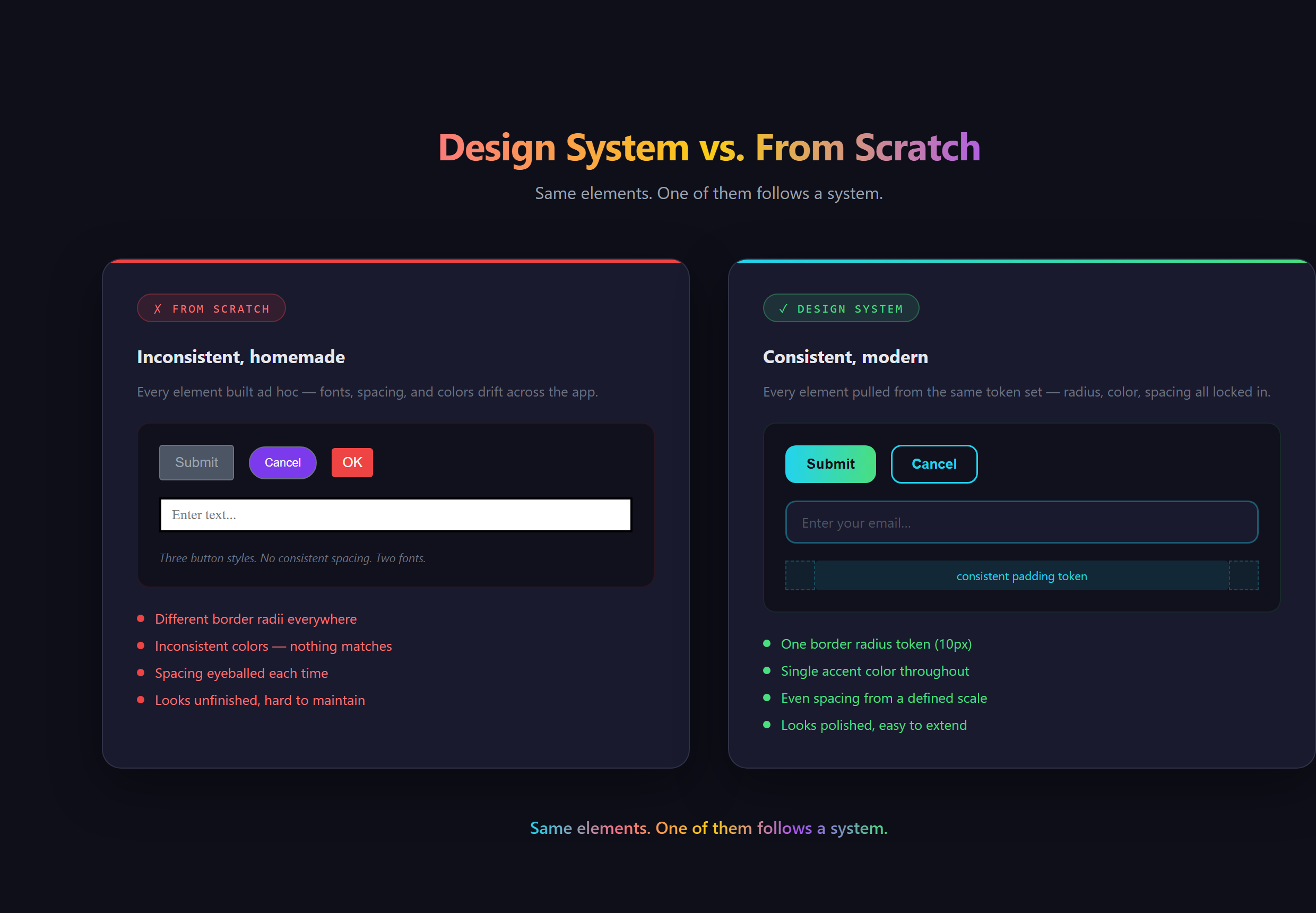
What actually makes a UI look modern?
Strip away the mystique and "modern" comes down to a handful of fundamentals working together. Generous, consistent spacing so nothing feels cramped. One type family at two or three sizes, not five fonts fighting for attention. A single accent color against a calm neutral background. Clear hierarchy, where the most important thing on the screen is visibly the biggest. Alignment, so edges line up on an invisible grid.
None of those are artistic. They are closer to grammar. You have seen this every time you open something like Notion or Stripe and the page just feels calm and expensive: that calm is spacing and restraint doing invisible work, not a stroke of genius.
Why does good UI matter more than you think?
People decide whether they trust your app in the first second, long before they read a word. A cramped, clashing layout signals "amateur," and amateurs do not get credit cards typed into their forms. A clean one signals "this is a real product made by real people." Same code underneath, completely different outcome.
There is a business edge to it too. The look of a thing quietly sets the price people expect to pay for it. Two apps that do the identical job can feel like a free weekend hack or a paid tool, and the only difference a visitor can point to is the interface.
What goes wrong when you wing it?
Without a few rules to anchor you, every screen drifts. You pick a slightly different blue on page three. The buttons end up three different sizes. One section is packed tight and the next is swimming in space. Nothing is technically broken, but the whole thing feels untrustworthy in a way most visitors cannot explain. They just leave.
The usual reaction is to keep nudging pixels by hand, one tweak at a time, hoping it all adds up. It rarely does, because the problem was never one button. It was the absence of a system that keeps every button consistent without you babysitting it.
Where does the taste come from, if not from you?
Here is the part that changes everything for a non-designer. You do not invent the taste. You borrow it. The modern web runs on design systems and component libraries: pre-built, professionally designed sets of buttons, cards, and forms that already follow every rule above. Pair one of those with an AI assistant working alongside you in VS Code and you get to direct the look instead of drawing it.
This is newer than it feels. For years, professional design was gated behind expensive tools and years of practice, which is exactly why most homemade software looked homemade. Shared component libraries cracked that open. The skill is no longer pushing pixels. It is knowing the vocabulary (spacing scale, hierarchy, accent color, component) well enough to describe the vibe you want and recognize when the result is right. That shift, from drawing to directing, is the whole reason one person can now ship something that looks like a funded startup. It is a core idea behind how we teach people to Make Anything With AI.
So do you actually need to learn design?
No, and that is the honest answer. You need to learn enough to see: to look at a screen and tell whether the spacing is consistent, the hierarchy is clear, and the colors are calm. Taste you can recognize is taste you can ask for. You become the art director, not the artist, and the art director is the one who gets the credit anyway.
Steering a modern, professional interface out of an AI assistant, without ever opening a design tool, is covered in Venom AI's Tier 2. Learn to see the handful of rules, and you will never ship something that looks homemade again.