

You build a page, step back, and something is off. The content is fine, but next to a site you admire, yours just looks like a school project. You cannot quite say why, which is the most frustrating part. The good news is that the difference is almost never talent. It is a short, learnable list of fundamentals, and once you can see them you cannot unsee them.
In short, a website looks professional when a small set of basics, spacing, type, color, alignment, and hierarchy, are handled consistently. Get those right and even simple content looks credible.
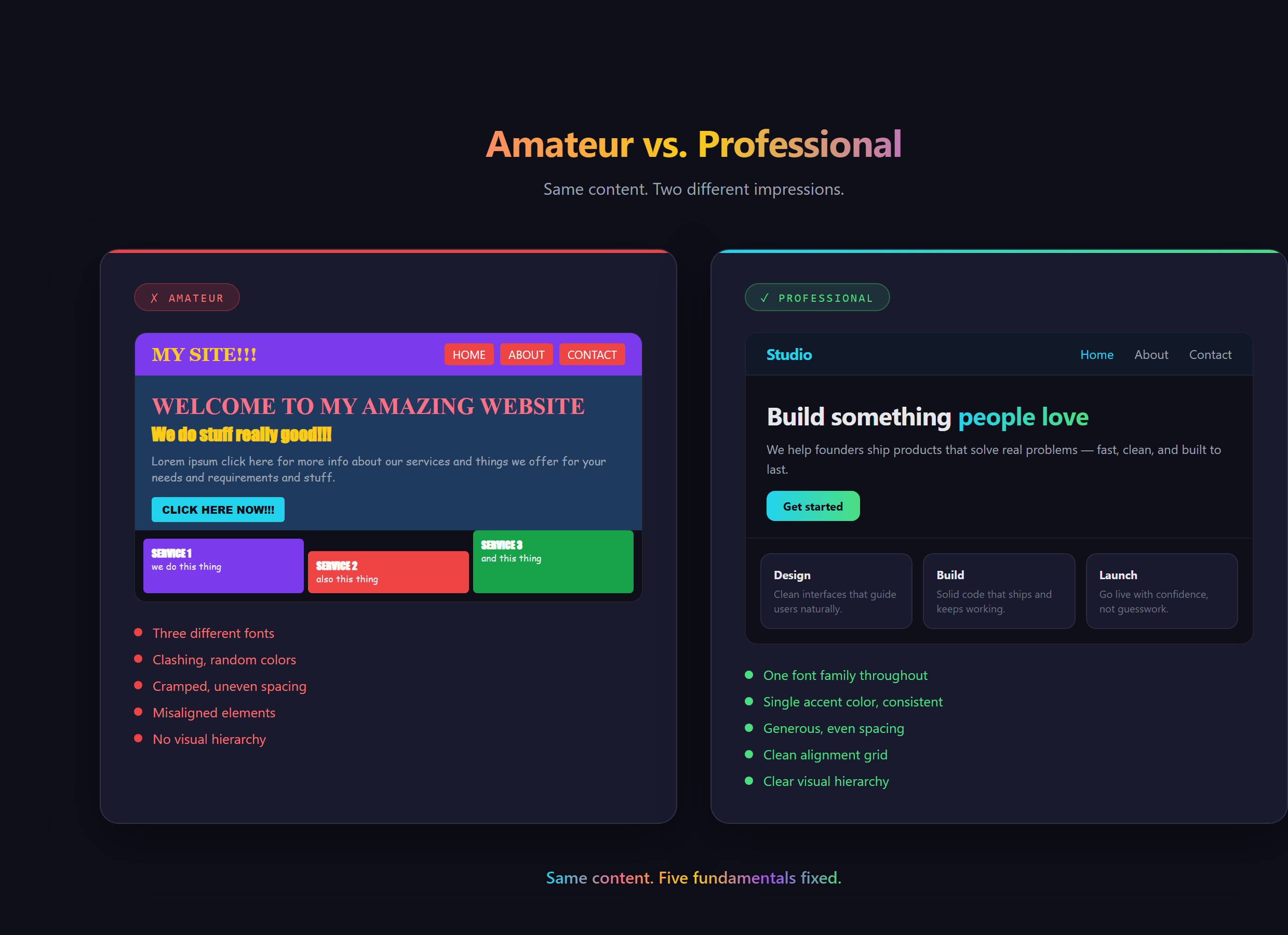
The look is mostly space
The single biggest tell is whitespace, the empty room around and inside things. Amateur pages cram everything together as if space is being rationed. Professional pages let things breathe, with even, generous gaps that give the eye somewhere to rest. You have felt this without naming it: the calm, expensive feeling of a well-spaced page versus the cluttered anxiety of a busy one. Space is free, and it does more for a professional look than almost anything else.
Restraint beats variety
Beginners reach for variety, three fonts, a rainbow of colors, because it feels like more effort means more polish. It is the opposite. Professional design is disciplined. One or two fonts. One main color plus a single accent. A consistent size for headings and another for body text. The restraint is the skill. When everything is shouting, nothing is heard, and a page that uses five fonts reads as five times less trustworthy, not five times more interesting.
Hierarchy tells the eye where to go
Visual hierarchy is the quiet rule that the most important thing should look the most important. A big bold headline, a calmer subheading, and steady body text create a clear path for the eye to follow. You have seen this on every well-made landing page you have ever trusted: you knew instantly what it was and where to look, because the design ranked the information for you. Without hierarchy, everything is the same weight and the reader has to do the sorting, which feels like work.
Consistency is what reads as "real business"
The last fundamental ties the others together. The same spacing rhythm, the same button style, the same heading sizes, used on every section and every page. Consistency is the signal a human brain reads as "someone competent made this on purpose." Inconsistency, a button that looks different on each page, spacing that jumps around, reads as careless, even when the work behind it was hard. This is exactly the kind of detail we drill at Venom AI, because it is invisible when right and glaring when wrong.
What goes wrong without the fundamentals
Skip these and your site can have perfect content and still lose people in the first two seconds. Visitors will not say "the spacing is uneven." They will just feel that something is off and trust it less, and you will never know why they left. The cruel part is that the content was fine. The packaging undersold it. That is a fixable problem, and once you know the list, fixing it is mostly a matter of asking for the right thing.
The exact way to apply each of these fundamentals, and how to direct your AI assistant in VS Code to nail them on the first pass instead of the fifth, is covered step by step in Venom AI's Tier 1. Looking professional is not a talent you are born with, it is a checklist you learn, and it is a big part of how you Make Anything With AI that people actually take seriously.